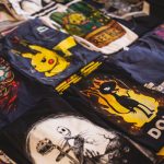
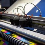
There are several popular printing techniques used to create custom clothing and other products, but which one is best suited for your business? Each printing process has special functions that work better with some materials or budgets than others. One of the most common printing types is dye sublimation printing while another popular format is
Are you looking for printed products that are long-lasting and feature distinct colors and high-resolution quality? The best designed graphic apparel, home décor, and advertising displays use the dye sublimation process to achieve vibrant, everlasting graphics. So, what is sublimation printing and why is it so effective? All of the information you need to know
Having a profitable business doesn’t just mean having the best product or services available in your industry. It’s just as important to get your brand out there so that you reach more customers and make more sales. But how do you do that? How can you promote your business so that you spread your brand
If you are holding an event and want to get the word “out there” or to decorate an event with a name or brand, the perfect addition is signage. Using event signage to showcase the name of an event, a guest of honor, or the logo of a sponsor adds atmosphere and branding to special
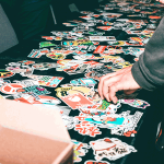
Customizing stickers for your business, as gifts, or for your car or windows is a fun activity. Finding the best sticker for your purpose is almost as important as the design you create for them. Chances are, you already have an intended purpose for them, such as securing them to your car, using them as
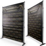
Trade shows are a great way to spread brand awareness and gain new customers, but at every trade show a business must compete with a sea of other companies, all trying to achieve the same outcome. How do you make sure your booth stands out among others? How can you grab the attention of people
If you are a gamer or an office worker, chances are you use mouse pads with your desktop computer to help control your movement and cushion your wrist. A dirty mouse mat can cause problems when moving your mouse. This is a big issue for gamers and office workers who need to use their mouse
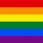
We all know the famous rainbow flag that represents gay pride. There are, however, many flags recognized among the LGBTQ+ community to symbolize the wide range of sexual orientations and gender identities. Why are there so many LGBTQ and gender flags and meanings to stand for the specific groups of the community? Monica Helms, the creator
Life has been flipped upside-down for all of us during the COVID-19 quarantine. Businesses are closing and the government is issuing stimulus packages as the unemployment rate begins to skyrocket. While many people share the fear of an unpredictable future, the only way to combat the virus is to remain in isolation to help flatten
Did you just purchase a vinyl backdrop or tablecloth and discovered that it was wrinkled when you removed it from its packaging? Or, have you kept a vinyl banner in storage for a while and discovered it’s very wrinkled when you took it out for use again? Maybe someone stored it incorrectly and now your