
The Color Spectrum: RGB, CMYK and Pantones
Last month, as part of our series on design, we talked about the seven elements of good design. One of the biggest elements of good design is color – specifically how best to use it to draw audience attention. In this post, we’re going to take a slight step back from that and talk about the history of color, how we actually see color and then a little bit about each color spectrum that a graphic artist might use: CMYK, RGB and PMS (Pantone Matching System).
The history of the color spectrum
The first discoveries in the science of color were made by the English scholar Roger Bacon in the 13th century. By passing light through a variety of transparent globes or prisms, Bacon was able to infer that this produced a rainbow of color, though the method of producing just one type of color had yet to be discovered. Four centuries later, in the 17th century, Isaac Newton would continue Bacon’s experiments.
Where Bacon used the method of agreement to prove his experiments, Newton used the method of difference. Instead of looking to see if phenomena had things in common and using that as the basis for comparison, Newton looked for the differences.
First, he passed white light through a prism. This showed that white light could be broken down into its component colors. But more experimentation was needed to reach a concrete conclusion. So Newton used a screen to separate out a single color from the rest and then passed it through another prism to show that the prism itself wasn’t the cause of the other colors.
As part of his experiments, Newton found that there were seven colors on the color spectrum: red, orange, yellow, green, blue, indigo and violet. It’s from this original reading of the color spectrum that the acronym “Roy G. Biv” comes from. Because the spectrum colors didn’t seem to be coming from anything and were inherent to the light itself, Newton named them “spectra” (Latin for “spirits”) and the whole arrangement a spectrum.
Instead of the color line or rainbow that most of us are probably familiar with, Newton instead used a color wheel to represent his version of the color spectrum.
Newton’s color wheel
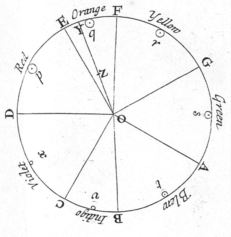
Newton’s color wheel, however, looks a little different than the ones you or I might be used to. Newton compared his color wheel to a run of musical notes. It started with “D” and ran the whole way around to C. The middle of each color, where it was most vibrant, is marked with a letter. The center of the circle is the white light that each of the colors come out of. In this way, colors could be described based on their distance from the center and the closest middle color.
Newton’s version of the color wheel slowly morphed into the color wheel as we know it today. The musical notation disappeared. The colors devolved from 7 separate, distinct color notes to, in some case, just Red, Green and Blue or even no colors at all. The white slowly began to recede into the center until it was almost invisible. The modern color wheel was born.
So how do we actually see color?
We see color a lot differently than how most people actually think we do. For example, if I were to have you look at a stop sign and tell me what color it is, you’d tell me that it’s red. However, it’s actually every color but red. This is because of how light behaves in regard to objects and also how our eyes and our brain work together to translate light into color.
When white light hits an object, (like the stop sign in our example), the object acts like a prism. It refracts, absorbs, or reflects the light that hits it. This causes the different wavelengths of colored light that make up that white light to be interfered with on their way to our eyes. Depending on the type of object that’s being used as a prism, certain colors may be absorbed while others are refracted. This is mostly based on the wavelengths that those lights inhabit, as shown by the color spectrum chart below.

Because of this, when you look at a stop sign and see that it’s red, what you’re actually perceiving is the light that has been reflected off the sign, which your brain perceives as red.
So what does this have to do with there being three different color spectrums?
CMYK, RGB and Pantones – what’s the difference?
The main difference between the three different color spectrums is that they’re based on the intended use of your design. So if you’re designing something for a website or other online consumption, you’d use RGB, whereas print designs can use either CMYK or PMS depending on the level of exactitude required.
RGB
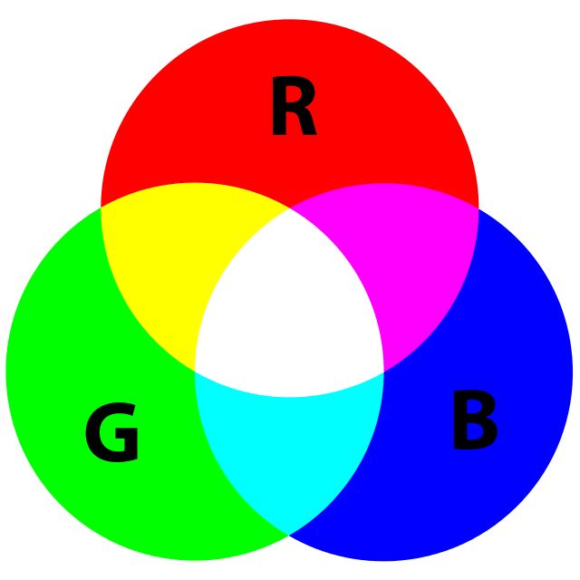
RGB (which stands for Red, Green, Blue) is the default color spectrum in use for screen viewing and the web. This is because screens begin as black boxes, then emit light as color is added. Since color has to be added to the screens to turn them into another color besides black, RGB works as an additive color spectrum: you add degrees of the three main colors to the screen in order to create the colors you’re looking at.
Each RGB color is written as three values inside of a set of parentheses. For example, the color red on the RGB color spectrum is listed as (255, 0, 0). This means that the red is boosted to 100% density, while the blue and green have been reduced to zero. If you boost all three colors to 100% density (255, 255, 255), you get white.
CMYK

Unlike RGB, CMYK (Cyan, Magenta, Yellow, BlacK) is the baseline when it comes to print design. It also works in an opposite way to RGB: while the goal of RGB is to be an additive color spectrum, CMYK instead works as a subtractive color space.
The goal of CYMK is not to add color to a black screen. Instead, you’re subtracting the amount of light being reflected by a white piece of paper. By adding variations of cyan, magenta and yellow ink to absorb light, you’re subtracting the types of light waves being reflected back to your eye.
When cyan, magenta and yellow are combined together, they absorb all light, making the paper appear black. Black is huge in ink mixing, so it is often included as separate color in order to save on cyan, magenta and yellow ink.
PMS
PMS stands for Pantone Matching System. Much like the CMYK color spectrum wheel, PMS colors are used as part of the ink mixing process for print design. However, where CMYK is used simply as a way to render colors for print, the Pantone Matching System is intended to be a way for printers to replicate tones and colors using a standard guideline.
Because of this ability to achieve and preserve consistency, Pantone colors are used as a baseline for everything from company logos to trademarks to national and state flags. While Pantone colors can be built with a four-color mix (like CMYK), this often results in a color shift like the one below.
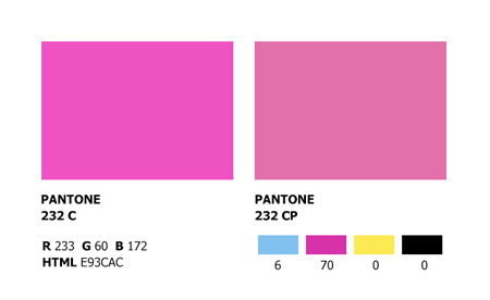
To examine things a little further, you can see that the Pantone color listed as “Pantone 232 C” has two values listed – the three numbers for an RGB color code, and the hexadecimal code for HTML and web colors. On the other hand, the color listed as “Pantone 232 CP” has four values listed: one each for cyan, magenta, yellow and black.
Pantone 232 C is also much darker than Pantone 232 CP. This is because of the difference between the two types of inks. CMYK inks are meant to be combined with each other, so they’re transparent. PMS inks are meant to stand alone, so Pantone inks are made to be opaque.
You might be wondering: if Pantone inks are opaque, why do companies use them for company colors?
Because of the opaqueness and brightness of Pantone color spectrum inks when compared to CMYK colors. If you look at the example swatch above, you can see how much brighter the regular Pantone swatch is compared to the Pantone CMYK swatch. This consistent color brightness can be maintained across mediums. Starting from a Pantone swatch means you don’t have to worry about whether you’re picking the right shade of green. All of the information is listed on the swatch. That’s why many companies build their company colors or logos using Pantone colors first, then expand outward to use RGB, CMYK or hexadecimal values once the Pantone colors are finalized.
For more information about the color wheel, and how to use Pantone colors as part of your printing process, check out the Pantone Color Institute.
Implementing the color spectrum in a project
So now you have some knowledge about the different color spectrums that exist and the main differences between them. How do you go about using that knowledge on a project?
Having this knowledge makes it much easier to ensure that you’re sending the right types of files to the right people. So if you’re working with a web designer to make the layout for your company’s new website, you now know to send that person all the colors they’re looking for as either a trio of RGB numbers or an HTML hex code.
You’re probably wondering: how do I convert between all the different color formats?
If all you have are the CMYK values or the Pantone swatch, converting them to RGB or a hex code is pretty easy. In the case of the Pantone swatch, the RGB colors and the HTML hex code are listed on the swatch.
For everything else, Code Beautify makes a great CMYK to RGB converter so that you can take all of your print colors and convert them seamlessly into colors that are suitable for the web.
For converting from CMYK to Pantone colors, there are tools in most graphic design programs that do this for you. We even wrote a guide on how to convert CMYK to Pantone using Adobe Illustrator.
While using a color converter is great in a pinch, here’s the deal: there’s no shame in having to ask for a professional’s help. In fact, that’s what you should do first.
Having professional help makes it that much easier to outline your company’s logo using all three color models. Using all color models is a must when you’re trying to design a brand that looks continuous mo matter what it’s displayed in.
Quick takeaways on the color spectrum
We hope that by the time you’ve read to the end of this post that you have a pretty solid idea of what the differences are between the color spectrums. If not, take a look at some of the key points:
- RGB adds color to a black screen. Each value adds light to the screen in the form of a color we can see — an additive color spectrum.
- CMYK subtracts light from a white sheet of paper to create colors. Each value subtracts light from the paper in the form of color we can see – a subtractive color spectrum.
- Pantone swatches usually contain all of the different color models you might need for a given color. It’s best to start with a Pantone swatch when you’re building your company’s colors. This way you don’t end up with fifty shades of grey.
Sources
1. Introduction to Light: The Physics of Light, Vision, and Color
2. Seeing Color In A New Light
4. What’s the Difference Between Pantone, CMYK and RGB Colors?

What is Sublimation Printing? – The Ultimate Guide (2025)

The Principles of Good Banner Design