
How To Match The Right Pantone Color When Designing For Print
Designing with the right color in mind is of utmost importance when it comes to ensuring that you have a top-notch production run. What do I mean by the right color, though? Well, on Thursday I talked about the difference between CMYK, RGB and Pantone colors and that distinction is even more important here when it comes to designing for print.
When you look at a color on-screen, it looks entirely different than a color printed on a piece of paper using ink. Why? Because the RGB color spectrum and HTML hexadecimal model are used only on screens. They work by adding light to a dark screen. CMYK and Pantone work by subtracting the light reflected off a white piece of paper. Since you’re printing your design on paper (or cloth or whichever material you choose), it’s important to design using CMYK or a Pantone color right from the start.
The history of Pantone colors
Pantone colors came out of the commercial printing arm of a company called M&J Levine Advertising. The two brothers that owned it, Mervin and Jesse Levine, had a problem. They had many different styles of pigments and inks that they could offer their customers, but no standardized system to ensure that they were giving customers the same shade of a color every time.
Here’s the solution they found:
In 1956, the brothers hired Hofstra University graduate Lawrence Herbert as a part time employee of the printing division. Herbert used his chemistry knowledge to standardize and systematize the company’s stock of inks and pigments. The beginnings of the Pantone Color Matching System as we know it was born.
But the company still didn’t have the name “Pantone”. That didn’t happen until 1962. By that time, Herbert had been running the ink and printing division at a profit. He decided to purchase it for himself: subsequently, he bought M&J Levine Advertising’s technological assets for $90,000 and renamed it all to “Pantone”.
Why are Pantone colors important?
Pantone colors are hugely important for color consistency. They allow designers to color match specific colors when they have designs that are beginning to enter the production stage – no matter what equipment is being used to produce the design.
How do they do this?
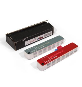
The secret to the Pantone system is the fact that each color can be found in the Pantone Guides that Pantone puts out: these guides are made up a large number of small (6”x2”) cardboard sheets with a series of related color swatches. Each color swatch is given a Pantone Matching System (PMS) number. In this way, designers can refer to a color by its PMS number and ensure that they’re getting the exact same color every single time.
Not only are Pantone colors important for designers, but they’re important for buyers, too. When people are looking at colors for branding, packaging or other products, they often find a “golden color” — a color that they completely fall in love with. So they want the colors of their products to match this golden color as exactly as possible. That’s where Pantone color swatches come in. By taking a picture of the product next to a Pantone color swatch of the color in question, buyers can look for slight color differences that might only be visible to the naked eye.
When it comes to getting Pantone swatches for use in print projects, there are two big things to keep in mind:
- What type of material you’re printing on. Pantone color books are printed on a variety of different paper stocks to mimic different types of material. If you get the wrong book for the material you’re printing on, any kind of color inspection you do is moot — the color was wrong from the start.
- When you get your Pantone books. Not only does Pantone release updated color books at set intervals, but the colors in the books you have fade after a while. We recommend that you only use Pantone books that you’ve purchased in the last year so that you can ensure you’re getting the most out of the books you have.
Coated vs uncoated – what’s the difference?
There are two different main styles of printing material: coated and uncoated. Why does this matter? Well, ink takes on the finish of whatever material it’s been printed on. For example, if you print on a piece of regular paper (for letterhead), the uncoated paper will absorb the ink and come out a little less vibrant but with a matte finish. On the other hand, a coated surface like poly tape allows the ink to sit atop the material so that it retains its vibrancy and comes out with a glossy finish.
The difference between coated and uncoated Pantone swatches is more drastic in dark colors than in light colors. That’s because dark colors have more color pigment in them. On the other hand, light colors have a high percentage of transparent white ink, which is colorless. With more pigment, dark colors have more potential for variation.
What to expect when choosing a Pantone color
When you choose your color swatch from a set of Pantone colors, what you’re actually picking are a color or colors known as spot colors. Spot colors aren’t the standard mixes of cyan, magenta, yellow and black that you might be used to with CMYK printing. Instead, they’re inks that have been mixed beforehand and are added to the printer alongside the four CMYK colors. Depending on the number of colors you add, this can turn the simple four-color printing process of CMYK printing into six-color or even eight-color printing – something we’ll discuss in another article.
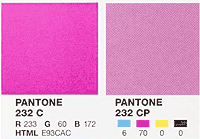
So how do you actually go about choosing and printing a Pantone color? Pantone sells a wide variety of different formula guides that include the many different types of Pantone swatches available. Each Pantone color swatch includes three different sets of values: the RGB values, the HTML hex code and the CMYK values. This way, if you find a Pantone color that you like, you can reproduce that color as accurately as possible both on-screen and through CMYK printing.
But this also lets you choose Pantone colors another way: you can find an HTML, CMYK or hex code color that you like, and then work backward to find the Pantone swatch that most closely matches it. As you look at different hex codes, HTML colors and Pantone swatches, it’s important to keep your print material in mind.
How to pick a Pantone color
To give you an example of how to best pick a Pantone color, we’ll walk through all the steps in the process.
Let’s say Tony is trying to design a brand identity package for a fitness company. He looks through the Pantone Formula Guide until he finds colors that he likes — in this case, he’s using 144 Coated, an orange color (shown below) as his primary color, noting down also the numbers of the blues and greens he’s using as secondary colors.

He designs the company’s logo and shows it to the client. The client OKs the proofs, so Tony notes down 144 C as his primary color, as well as the Pantone swatch numbers of the secondary colors.
These numbers are then sent to the printer along with a series of Pantone color chips in the same colors so that the printer has an exact reference for the colors Tony’s using. Pantone color chips are perforated squares of paper, three for each solid color in the Pantone library.
Using the same Pantone Formula Guide that Tony used earlier, the printer looks up the colors from the chips and notes them down on the printing ticket.
When the job goes to press, the press operator does the exact same thing. Each color will have a mixing formula guide attached to it. Depending on how the mixing is done, the mixing formula will either use Pantone spot colors (if possible) or a four-color combination for CMYK.
In our case, the printer is using the four-color combination for CMYK. So he notes down the percentages of each of the four colors that he needs: 0, 51, 100, 0. Each of the CMYK colors is balanced on its own 100-part scale, so the printer needs 0% cyan, or 100% white; 51% Magenta (mixed with 49% white); 100% yellow (0% white) and no key color.
Using the CMYK ink that was just mixed, the printer will print Tony’s logo on whatever print media he needs. He can then compare it against his color chip and, failing that, the color guide that he checked the chip against. In this way, Pantone colors can be used to guarantee color consistency from designer to printer to client and beyond.
If you have any more questions about choosing Pantone colors, feel free to leave them in the comments below, or reach out to us on Facebook and Twitter.
Sources
Pantone 2.0: After 45 Years, the Sequel to PMS

Finding the Best Sticker Sizes & Labels

What is Sublimation Printing? – The Ultimate Guide (2025)