The Principles of Good Banner Design
When it comes to design, “principle” can refer to:
- A way to lay down a design philosophy, both for user experience design and product design.
With this definition in mind, let’s look at all the different principles of good design and apply it to designing custom banners.
Principles for Good Elemental Design
Regardless of what other design principles you might follow, there are a couple of principles that every graphic designer or graphic artist needs to be aware of when it comes to a banner layout. Being aware of these will not only make you more effective when it comes to creating banner graphics but also help the content you create be both more appealing and informative.
Contrast
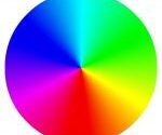
Quite simply, contrast is how we can tell one object apart from another, and it’s often used to emphasize key elements in design projects.
Contrast can be used to make elements of the banner “pop” and grab the viewer’s attention so that it serves as the focal point for the design.
Space
Also known as “white space” or “negative space”, this is the open area of the banner. More specifically, it’s the visible area between, above, below, and within the banner that have been used in a design.
Proximity
Proximity is the way that all the different elements that make up a banner design are grouped together. Put simply, it’s the nearness of one element to another. Proximity is meant to help both the designer, and the viewer maintain the continuity between visual elements on a page. Along with contrast, proximity is one of the elements that is designed to provide the viewer with a focal point.
Alignment
Alignment is the order and organization among the different elements that make up a banner. Elements that have been aligned properly create a visual connection with each other to communicate a story or a message to the viewer.
Designers most often use alignment to put all the elements in a design together in a readable arrangement. For more information on how you can use alignment to improve your designs, look at this article from Envato.
Repetition
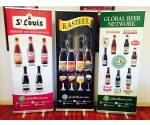
In most cases, repetition would be overwhelming and turn the viewer or customer away. Not so in banner design. Instead, repetition can be used as a visually appealing way to put emphasis on elements or grab the attention of a reader. Take, for example, this textless iPod ad:

The repeated use of people doing things with an iPod in their hand connects each of the four frames together, even though individually each person is different and they’re doing different things.
Principles of Good Banner Design Overall
As design bleeds more and more into the overall marketing space, marketers will have to contend both with designing custom banners and figuring how to both deal with bad bits of design and elevate the good parts of that design.
To that end, we’ve taken a leaf from the book of Dieter Rams, the chief designer for Braun from 1961 to 1995 and the industrial designer for Vitsoe for their 606 Universal Shelving System, 620 Chair Programme and 621 Table.
Let’s look at some of his principles of good design and see how they can be applied to banner design as well.
1. Banner Designs Must Be Innovative
When it comes to designing a logo for a banner, the possibilities for being innovative with your design are by no means exhausted. In fact, there have been several articles published about innovative design trends to watch out for, but here are a couple of the big hitters:
- Responsive and contextual logos: when it comes time to design a logo, you need to create an aesthetically pleasing design that can be used on any kind of banner, whether it be against a wall, from a ceiling, on a pole, or on a banner stand.
- Experimental typography: typography has always been experimented with – people have developed new typographic shapes and even modified pre-existing typefaces using illustrative techniques.
- Metaphors pushed to the extreme: while metaphors aren’t new to logo design, they’ve recently become a focal point of deep creative exploration. Consider what kinds of thoughtful and clever concepts you can use to give your logo more depth.
2. Good Design Makes a Product Understandable
When potential customers look at your company’s logo on a custom banner, they should have an immediate understanding of what that product does or what it’s used for. It clarifies the product’s use and structure. It makes the product “talk” – but at best, it should be self-explanatory as to what the product is or what it does.
3. Good Design is Honest
Don’t try to make your product any more useful, powerful, or valuable than it is. At best, you’re setting your customers up for disappointment. In the worst-case scenario, you may end up losing angry customers. Don’t try to manipulate your customer by making promises that you can’t keep.
4. Good Design Involves as Little Design as Possible
Dieter Rams’s guiding words when it came to his designs were “Less, but better.” Start with simple things first. Concentrate on the essential aspects to ensure that your products (and their logos) aren’t burdened by non-essentials on the banner.
What do you think are examples of good banner design? Feel free to comment below.
10 Tips for Designing the Best Roll Up Banner
How To Design Using Photoshop And The Rule of Thirds